ZEITGEIST
Website design for an iconic
San Francisco brand. Check out the live site at ZeitgeistSF.com

Methods
User Interviews
Affinity Map
Persona Development
Competitive Analysis
Design Studio
Rapid Prototyping
Usability Tests
User Report
Tools
My Roles
Figma
Wix
Pen & Paper
Lead UX Designer
Lead UX Researcher
PROBLEM SPACE
Zeitgeist is a bar located in The Mission district of San Francisco. The bar first opened its doors in 1977, making it one of the longest running bars in San Francisco. The bar has gone through many phases in its 43 years of business, and is currently accommodating a new type of customer — A tech savvy millennial. In order to bring the business into the 21 century I was hired to create a website for Zeitgeist.
What will design will resonate with the longstanding regulars but still bring this iconic brand into the 21st century?
Obstacles: 11 days to launch website before major event. Limited budget.
RESEARCH & SYNTHESIS
INTERVIEW INSIGHTS
Customers want basic information right up front. Where is it? When is it open?
People want to be able to see the food more than they want to be able to see the whole menu.
Users want to know what's good before they order. What is the business famous for?
Users are equally likely to visit the website on desktop and mobile.
PERSONA

COMPETITIVE ANALYSIS

The Mission District of San Francisco is a hub of restaurants, cafes, and bars stretching from Market St. to 25th st.
Customers have plenty of places to drink so it's important to play to your strengths and show what makes Zeitgeist different.
I selected a handful of bars within walking distance of Zeitgeist that offered the same or similar benefits: outdoor space, food, cheap drinks.


Looking at the Homepages of similar bars I saw that some places did a great job of showcasing their assets — for example, Southern Pacific's Atrium is prominently displayed — while other homepages did a great job of promoting their brand — for example, The Crafty Fox.


I knew that Zeitgeist customers wanted basic information right up front, something like Teeth, Kilowatt, or Benders. But I also needed to showcase the bars distinguished outdoor patio and food in a modern way without diluting the Zeitgeist brand.
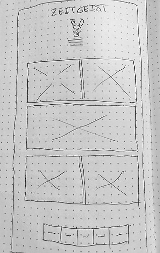
I also knew that a single page scroll was out of the question for a design because there would be too much information between the Menus and the Events. I needed to create sections for information to live in.
When considering the design for a brand like Zeitgeist, I interviewed stakeholders as well as customers. I highlighted these keywords to represent the brand:
Chaotic
Classic
Unapologetic
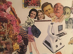
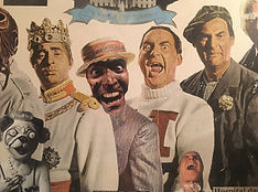
To save time and money I noticed that some of the art work Zeitgeist had already commissioned was a great fit for the design. I spoke with local collage artist Bill Blong about his work for Zeitgeist and which pieces he felt best represented the brand. Bill's knowledge and insight really brought the whole design together, and without his work this website would just be a case study for Information Architecture.


STYLE GUIDE


RESULTS
3K
unique visitors / month
37%
increased attendance at events YOY.
NEXT STEPS
Implement the E-Commerce function. I created several wireframes that have yet to be implemented due to time restrictions.


LEARNINGS
I saved my client a lot of time and money by exploring what resources we had available. I also learned that brands aren't something that you define. Brands are defined by the users, and no one knows a brand better than them. By taking a step back and letting others give their input I was able to create a better product — a product that felt comfortable and recognizable to the regulars, but modern and sleek to a more technologically adept customer.