TRAVELOCITY
A responsive web redesign to increase conversion rate

OVERVIEW
Methods
User Interviews
Persona
Design Studio
Prototyping
Usability Reports
Tools
Sketch
Figma
Team
Ash Burke
Hope Magracia
Jessica Chin
David Coughlin
My Role
UX Designer
UX Researcher
Scrum Master
PROBLEM SPACE
We found that people use travelocity as a tool to find the lowest possible airfare. Once they have found the lowest price they leave the website and continue to book directly with the airline.
Our objective was to help users accomplish their goals of finding the cheapest airfare, but also to increase user trust so that more users felt comfortable purchasing tickets through travelocity.
RESEARCH & SYNTHESIS
LEARNING MORE ABOUT USERS
User interviews were conducted in order to better understand the user’s mental model. What they were expecting from Travelocity, what they wanted from Travelocity, and what role Travelocity was fulfilling in the larger picture of the user’s objectives.
WHY DO PEOPLE USE TRAVELOCITY?
HOW DO PEOPLE USE TRAVELOCITY?
WHAT ISSUES DID USERS FACE WHEN USING TRAVELOCITY?
WHAT WE LEARNED
_edited.jpg)
We found our key insights through our user interviews. Namely, that users wanted to use Travelocity to find the lowest price airfare but didn’t trust it enough to purchase their tickets with them.
We noted how the user was feeling during the process, what they wanted to achieve, and how they wanted to achieve that, and we built that into the design.

Users leave Travelocity after finding the lowest price to make the booking directly with the airlines.

We synthesized all this information and created a persona that had behaviors, needs, goals, and pain points. Our persona guided us throughout the design process and helped focus our attention on solving their issue of not trusting Travelocity.
PROBLEM STATEMENT
People go to Travelocity to research the best travel prices. Rick is not sure he is getting all the information needed for a confident checkout.
How might we build his trust during the research and checkout process?
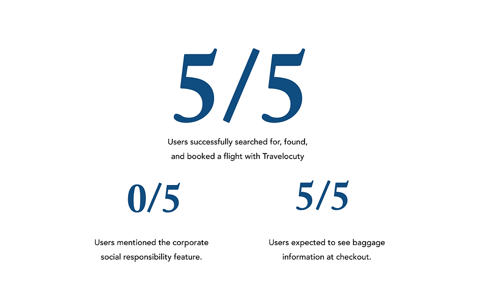
TESTING THE ORIGINAL SITE
Before we began designing we wanted to test users
on the original Travelocity site so that we would have a baseline to gauge the performance of our redesign. While all 5 users were able to complete the booking process there were some bumps along the way.


EXPLORING THE SOLUTIONS
We began our design process with 2 design studios that flushed out the possible solutions to our problem statement.
Our design studio leveraged the key insights we found in our user interviews and our Persona.


Low-Fidelity Homepage (above fold)
%203.jpg)
One of our primary changes was to simplify the home page above and below the fold. Our design got rid of many options and features that created distraction from the user’s primary goal of finding the cheapest flight.
Low Fidelity Homepage (below fold)
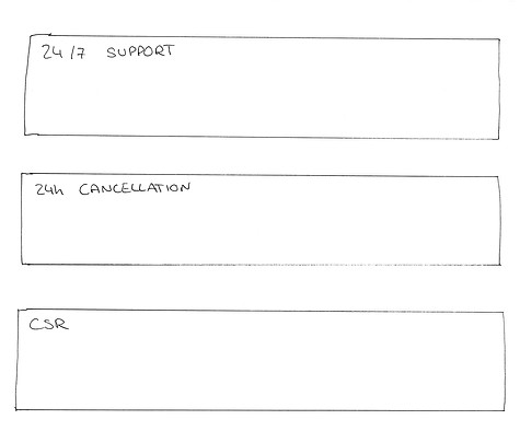
Below the fold we also scrapped a tremendous amount of promotional content in order to showcase Travelocity’s customer support and corporate social responsibility initiatives making the user feel more comfortable and confident.
Low Fidelity Search Results page (above fold)
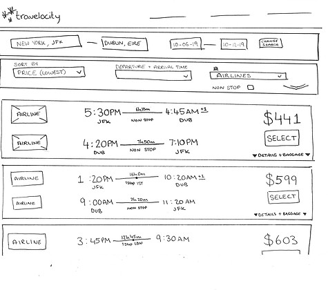
We relocated the filters bar to the top of the search results page so that each result can show the user all the important information they need right up front.
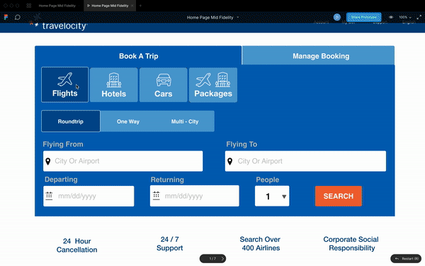
HIGH FIDELITY MOCK UPS
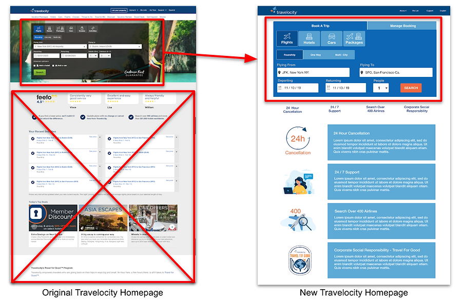
Here you can see how our redesign differs from the original Travelocity website. The search tool is simpler and more prominent, obscure ratings and promotional content is gone, and pertinent information is given a much stronger placement in several areas.

IDEATION & IMPLEMENTATION

RAPID PROTOTYPING
We measured time spent on homepage and time spent on search results page. We also measured how many applicants decided to move forward with a purchase directly with Travelocity.
Our mobile design was developed around the user's needs of research.
We found that users used their phones to research flights from time to time. So we created a mobile break point that allowed users to search for great deals and save them for later.
Our design follows our desktop break point. Full width results gives lots of space to show all pertinent details and creates an easy to save process.
Mobile Homepage

Mobile Flight Search

Mobile Search Results

WHAT WE SAW CHANGE

Our biggest gauge of success was the reduced time users spent getting from the homepage to the checkout page. While some sites want users to spend more time shopping, a reduction in time spent searching for our users meant the redesign was clear, concise, and users trusted the site enough to make their booking without hesitation.
NEXT STEPS
We want to implement the changes we made to the homepage, search results page, and checkout page. These changes were very successful in helping our persona use the search tool efficiently, and making him feel more trustworthy of Travelocity during the checkout process.
We still need to run tests on the mobile design to ensure that it meets user expectations.
We want to find a way to introduce the user to Travelocity’s Travel For Good program naturally so that upon checkout they feel more comfortable exploring that option.